Raiffeisen Bank
Developing
a sleek design
for ATM interfaces
The challenge
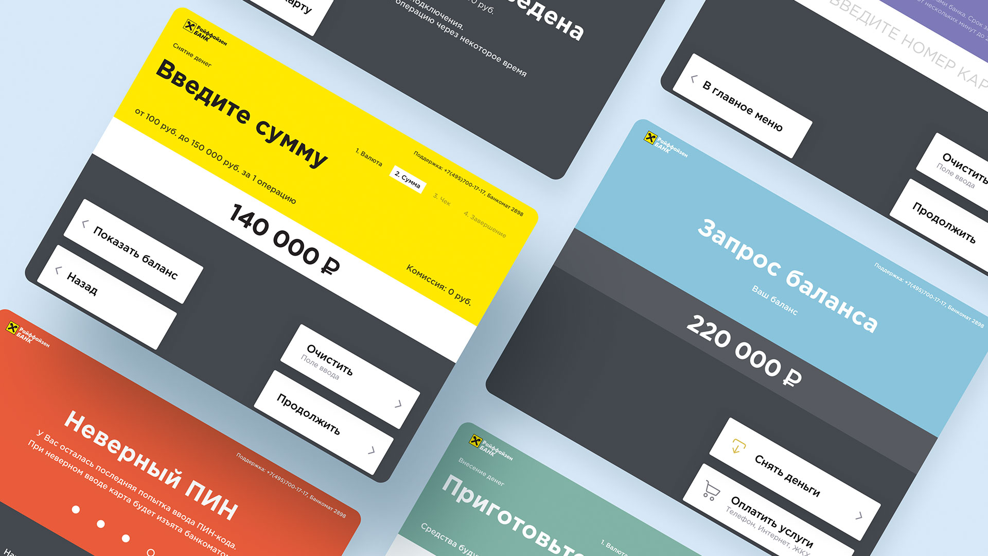
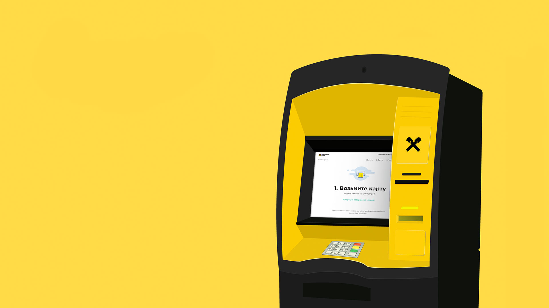
Raiffeisen Bank is one of the largest banks in Europe and Russia. During our time working together, we developed a novel interface design for ATMs, totally transforming visual components and fonts based on new ATMs. The innovative design is already in use among all the cash machines in Russia.
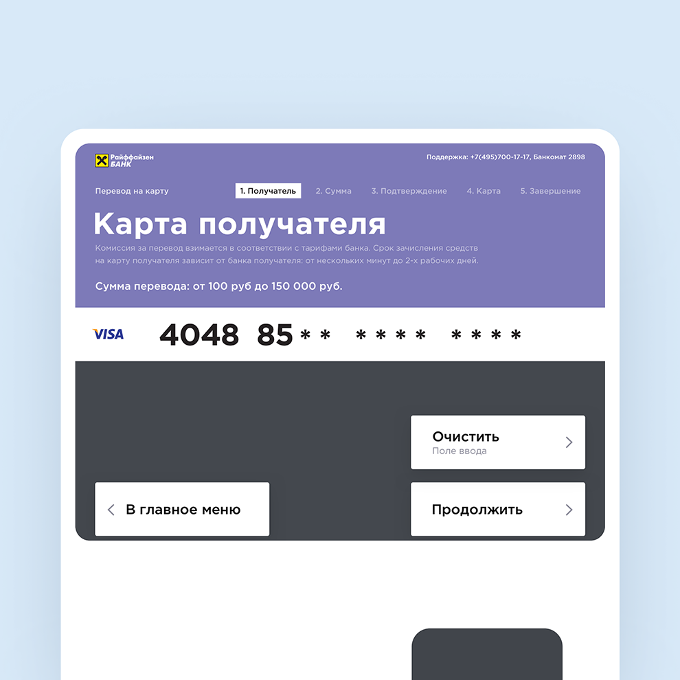
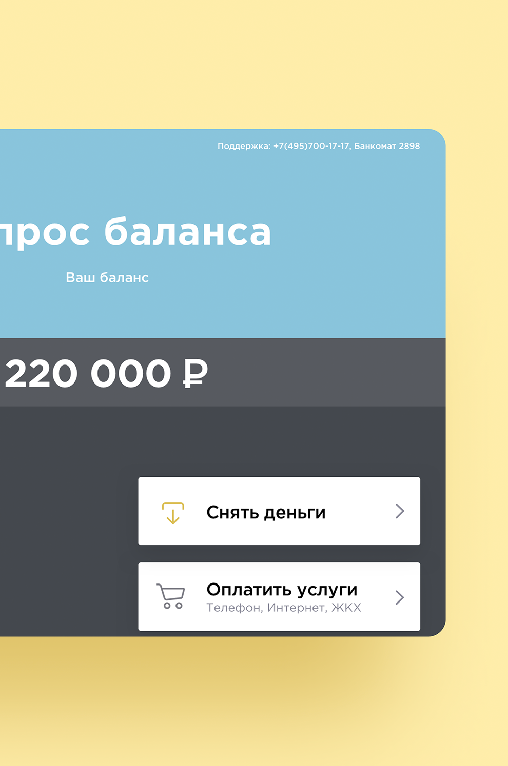
The design is founded on color coding principles. Every operation has its own associated color, and the operation names are now more readable. Color coding really streamlines ATM interactions.
Large, clear fonts make it easy to get the information you need from the ATM screen
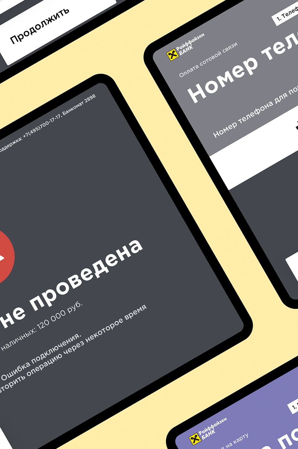
If you make a mistake, helpful hints pop up immediately
Main ATM interactions are accompanied by animated illustrations
Developing
the interface for
new ATMs
Developing
the interface for
new ATMs
The prestigious Raiffeisen Bank has one of the most appealing and intuitive interfaces for cash machines today. The screens are designed to be effortless so that an action can be completed with just a minimum number of steps.
