Potion
Sales tool
for increasing
conversions
The challenge
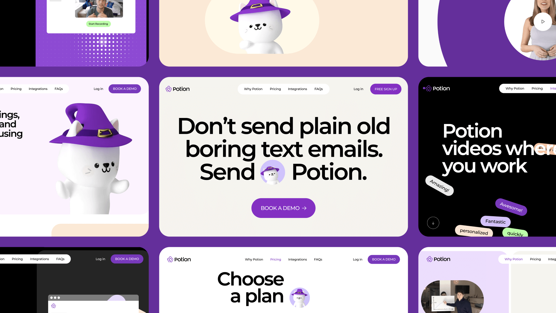
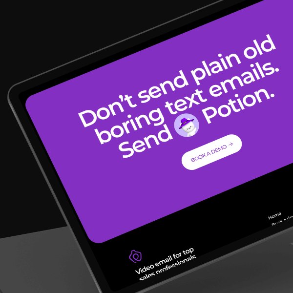
The task seemed quite trivial – the customer's site had become outdated, so the agency's main mission was to redesign it. But, not just a redesign was needed here, but a complete rebranding, a new corporate identity, and a fresh look at the Potion product.
We had to analyze the old version of the site, think about the general concept of brand promotion, improve the visual component and place the right accents to keep the audience on the new site.
Product goals
and objectives
Product goals
and objectives
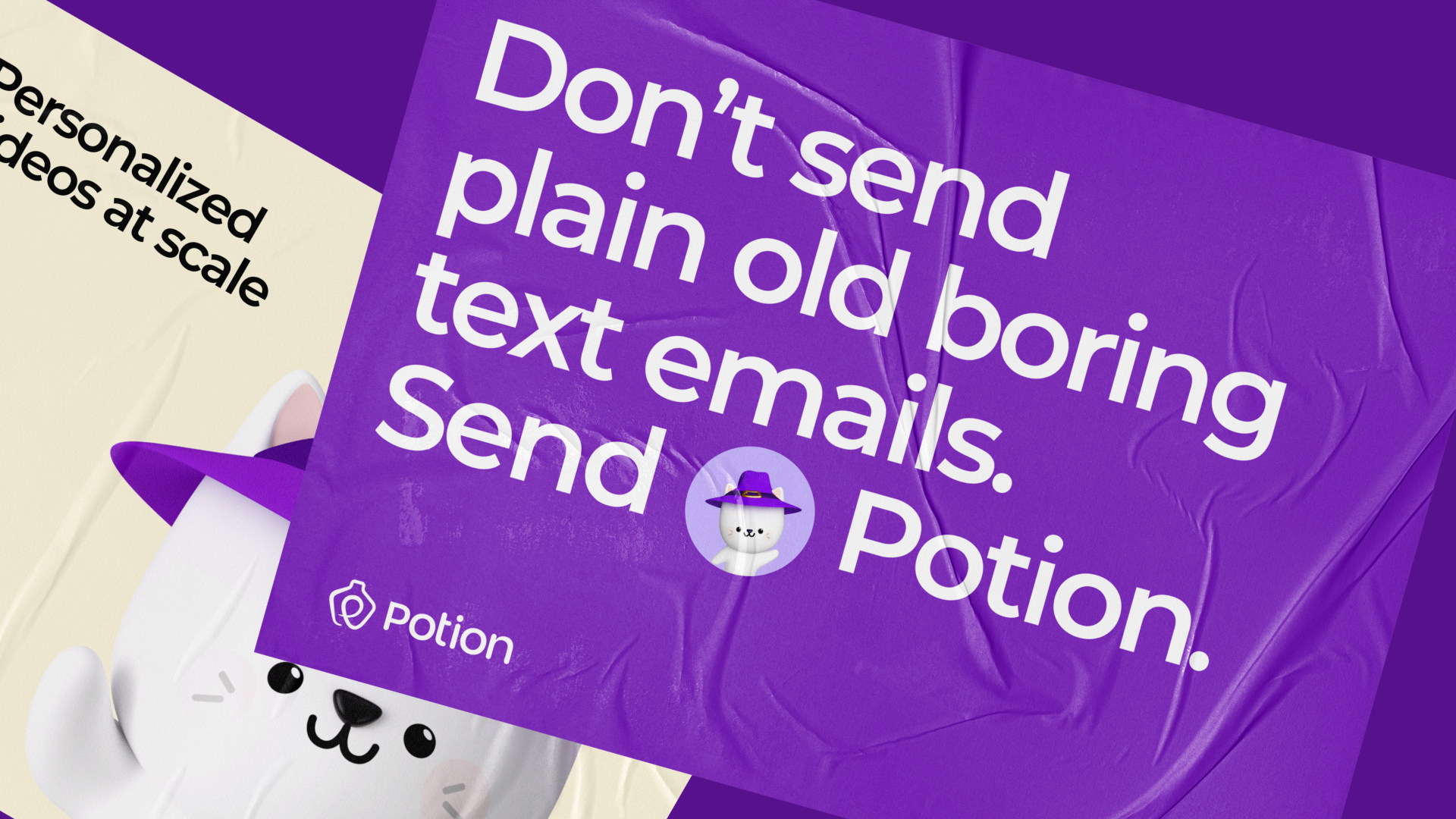
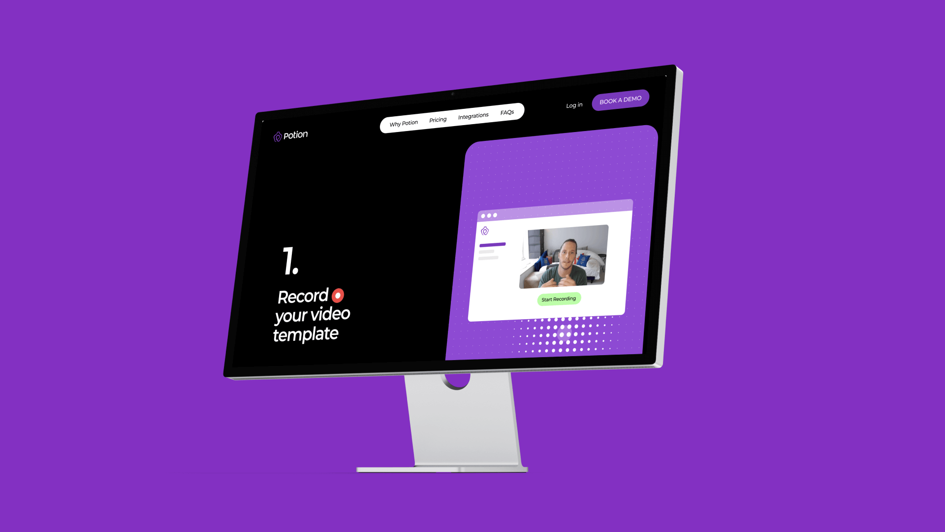
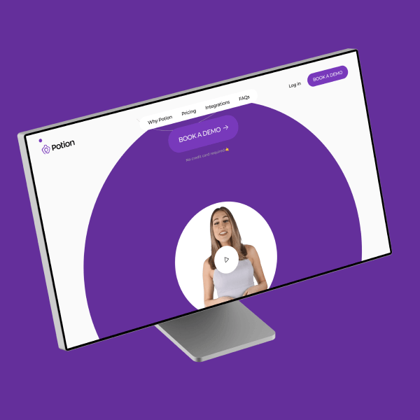
Potion is a simple but effective sales tool for increasing conversions from cold leads and emails. Work on the rebranding and creative concept of the site has been going simultaneously. We wanted corporate identity elements to form the basis of the new site.
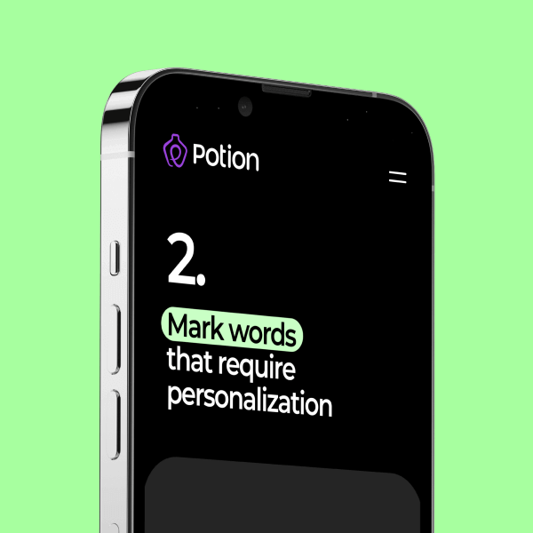
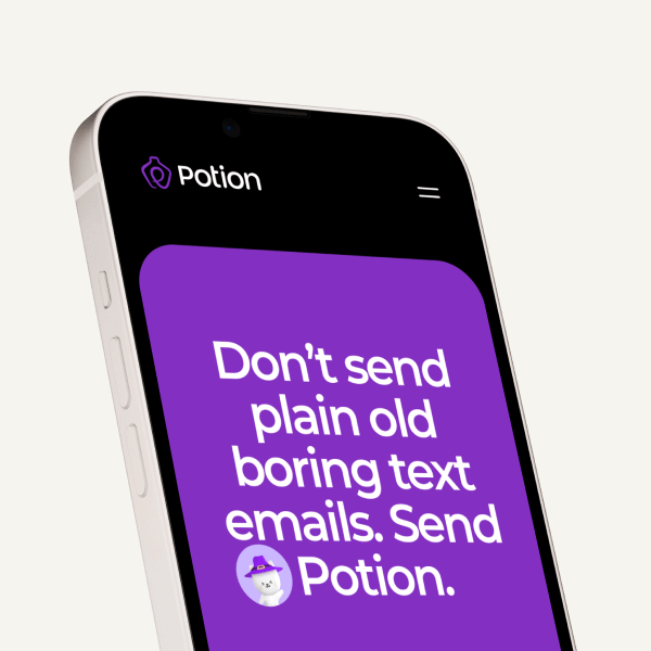
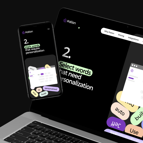
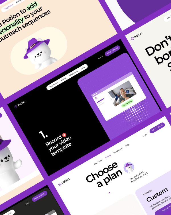
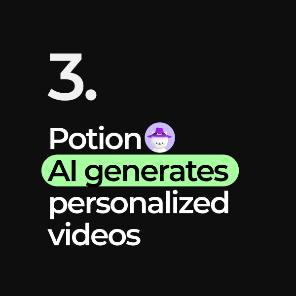
Potion allows you to create videos with different types of greetings, and you can highlight some of the text in the video and personalize them. Potion uses AI technology that automatically generates personalized videos for each prospect. That is, a certain “magic” symbolizes the name Potion. We developed this idea further and decided we would have a cat in a witch's hat that brews a potion.

Diary notes
Diary notes
As for the development itself, it is based on the lightweight Bona microframework. We have been using an excellent and productive solution from GreenSock as an animation platform for several years.
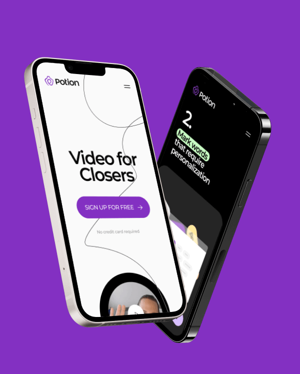
Responsive
web design

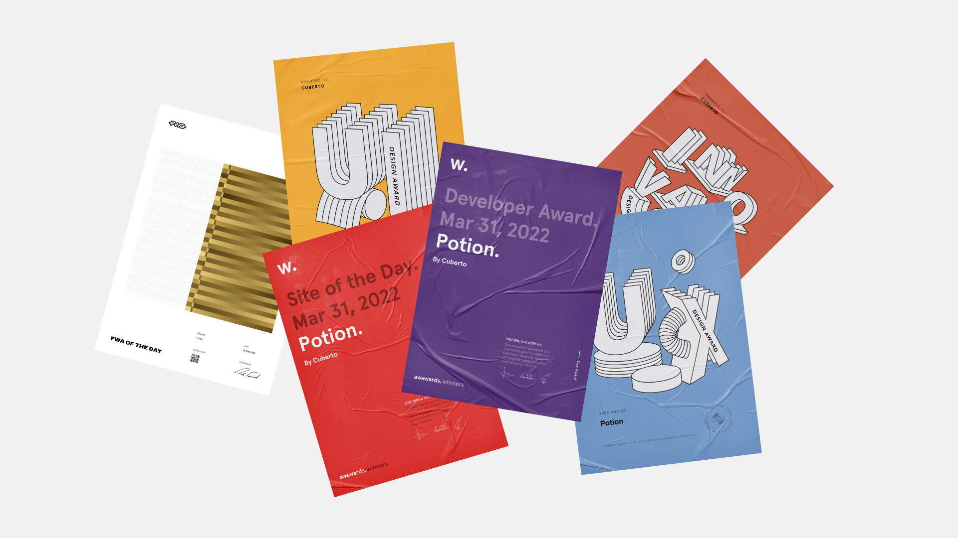
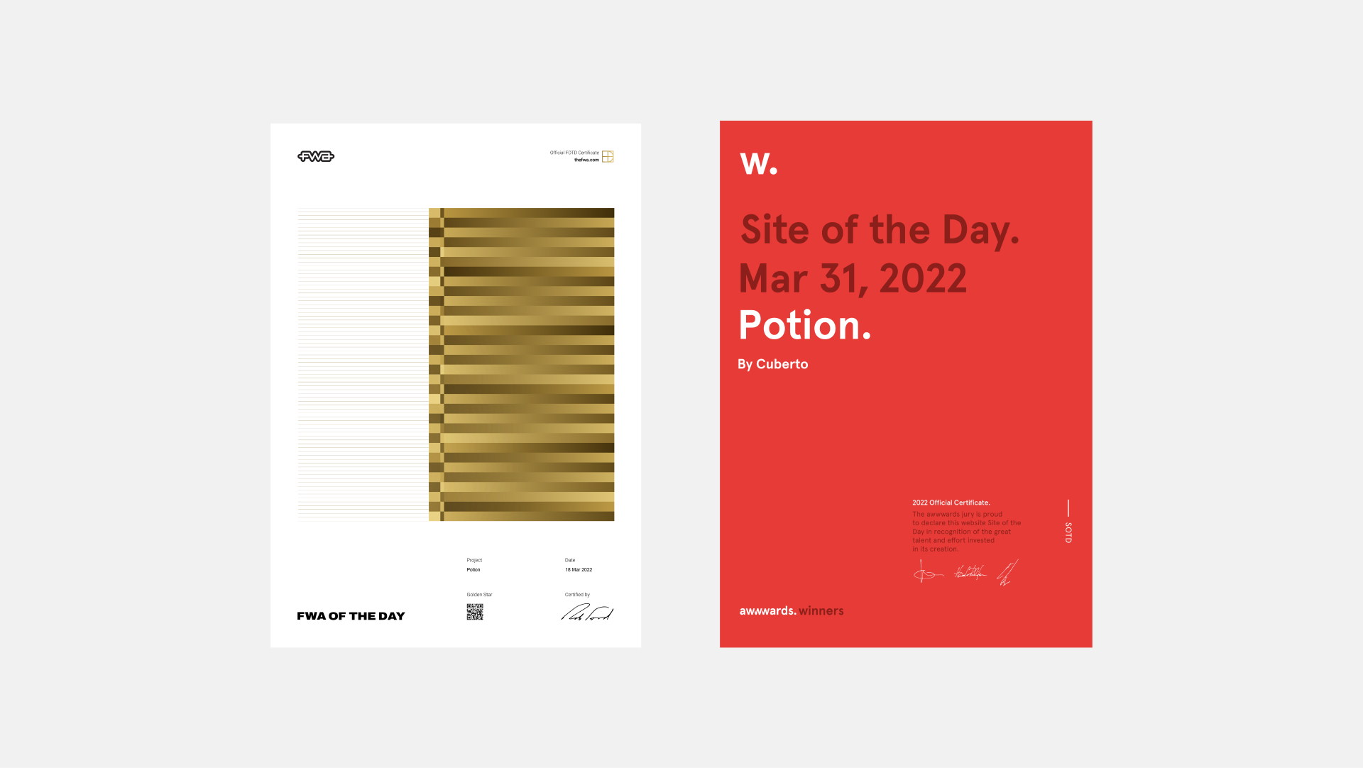
Site of the Day
Awwwards & FWA
Feedback
from client
Cuberto was engaged in developing our website and additional marketing materials, including theming and various creative assignments. Their efforts were highly satisfactory, and we were impressed with the Cuberto team's collaborative approach. Their team were amiable and accommodating to all of our requests, and also provided invaluable creative direction to the project.