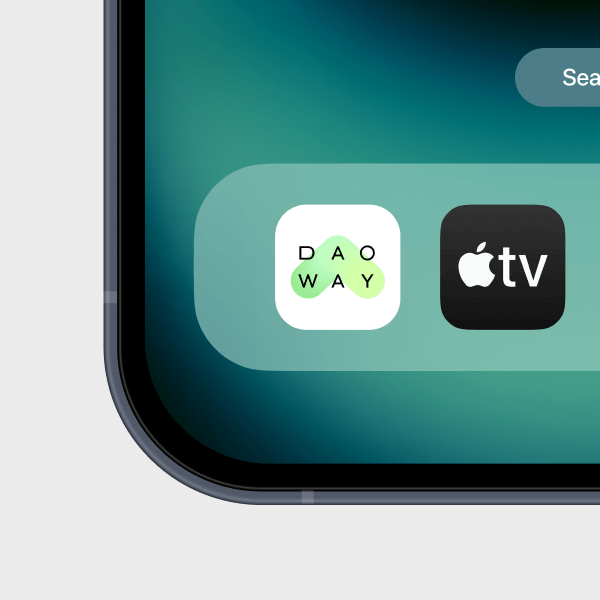
DaoWay
Astrology planner
app: plan,
achieve, thrive

The challenge
Our company specialises in startup development, and the DaoWay app concept immediately resonated with us.
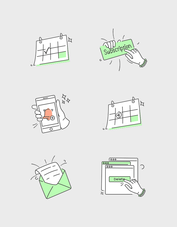
The client approached us with a list of key features intended for the MVP version of the application. Our task was to conduct market research and develop a product from the ground up for both Android and iOS.
Our team took full responsibility for the project, covering every aspect of development, including: brand identity from scratch, wireframing and user interaction logic, visual and graphic design, frontend development, landing page creation.

Product Overview
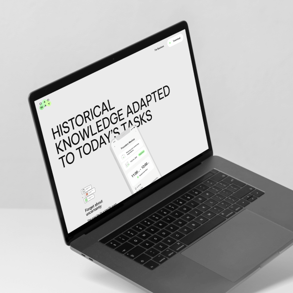
Product overview
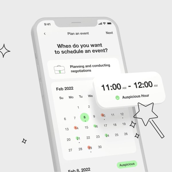
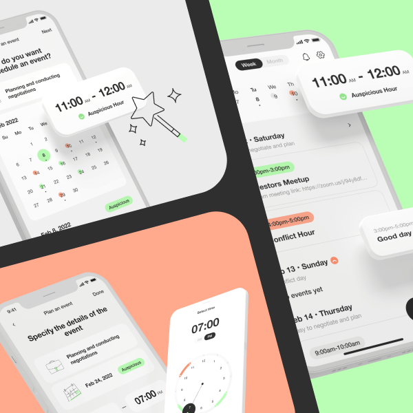
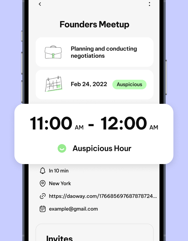
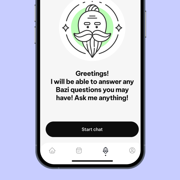
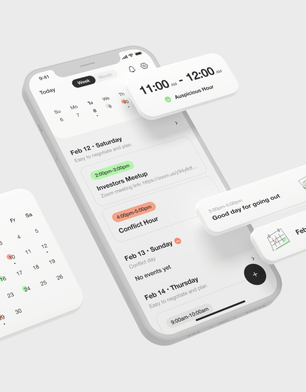
DaoWay is designed for a specific audience – those who believe in astrology and seek to channel their energy effectively. The app helps users plan their time wisely and distribute their energy in a balanced way.
At its core, DaoWay incorporates the principles of Ba-Zi, a discipline within Chinese metaphysics. By leveraging insights from the Chinese calendar, users can navigate potential pitfalls and avoid unnecessary conflicts. The calendar enables them to act as observers rather than emotionally charged participants in daily situations.


The core mission –
energy balance
The core mission –
energy balance
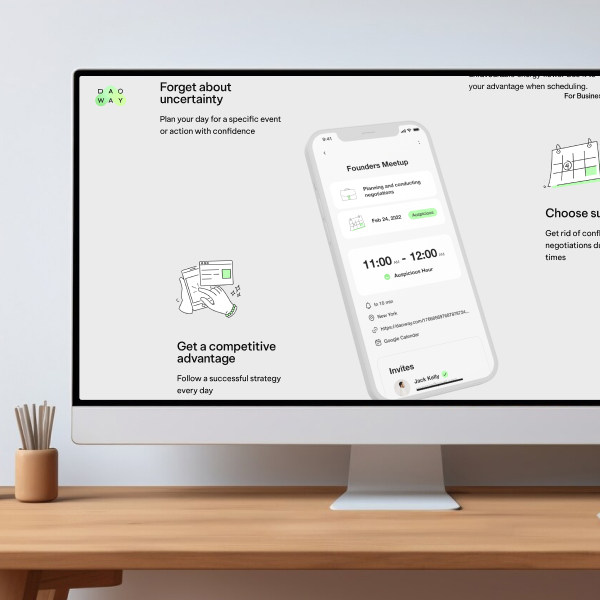
DaoWay highlights favourable and unfavourable energy flows, allowing users to align their actions and intentions with the most productive and beneficial pathways – moving with the current rather than against it.
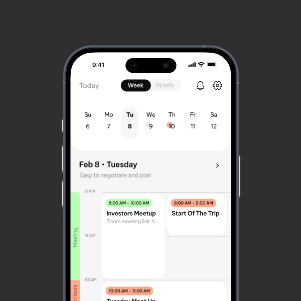
Development app
for iOS and Android

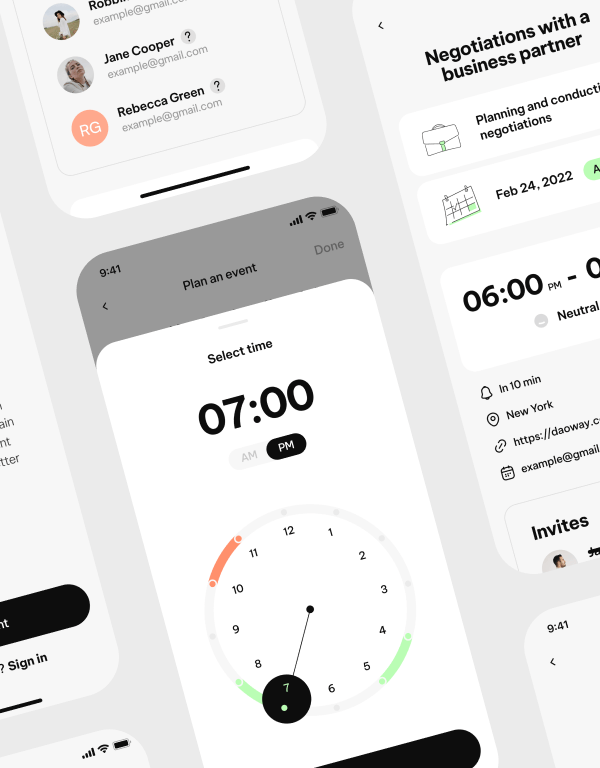


Graphic design


Feedback
from client
We've had an amazing experience working with Cuberto designers. They brought class, skill and creativity to the project. Looking forward to work with the team again soon!